• Skip to main content
  • Skip to primary sidebar

Zen Cart Optimization

Practical How To's for Increasing Ecommerce Sales

  • Home
  • Categories
    • Blogging
    • Conversion
    • Customer Retention
    • Design & Usability
    • E-Commerce Optimization
    • Email Marketing
    • Featured
    • Marketing Strategies
    • Marketing Strategies
    • Mobile Commerce
    • Podcasts
    • Search Marketing
    • Shopping Cart Abandonment
    • Social Media
    • Website Analytics
    • Zen Cart Google Analytics
    • Zen Cart Optimization
    • Zen Cart Recurring Billing

The Perfect Cart Experience

by Eric Leuenberger Leave a Comment

Ask any number of shoppers what elements would need to be present to create the perfect cart experience and you’ll likely get a variety of different answers—what’s good for the goose is not always good for the gander.

Although your site will see its share of different shopper demographics, there are a number of consistencies they all prefer and that should be in place if you are to have any chance of them buying from you. In this article I’ll outline a few consistencies all shoppers look for in the ‘perfect cart experience.’

The Perfect Cart Experience Checklist

  1. Make sure customers have a clear view of how to access their shopping cart from every page on your website. This means making a ‘shopping cart’ link or even showing them a summary of their cart contents at all times—not just if something is in their basket.

  2. Always display shipping costs and any tax applicable as soon as possible. Don’t make them wait to find that information out after they have already gone through a few steps in the checkout process. Doing this will yield frustrated customers and higher abandon rates.

  3. Give customers a choice of shipping options. Even if an order qualifies for free shipping (ground for example) based on some criteria you set, give the customer the opportunity to upgrade the shipping to a faster method (for an added charge) if desired.
    Free shipping is an excellent incentive and a powerful motivator, but don’t force a customer who qualifies for it to take it—they may want the item faster. Likewise, if they choose another shipping option, update the cart total to reflect that.

  4. Let the customer update and edit their cart directly from the shopping cart page. This has become pretty standard on all carts now, but I have run across a few that still make a customer click a link of a particular product, go to the product page, make your edits, and then updated.

    A ‘friendly’ shopping cart lets customers edit item quantities, remove items, alter attributes (product options), and more … all without leaving the actual shopping cart page.

  5. Prominently display any guarantees, privacy and security policies, throughout the site and frequently during the checkout process to build trust. Don’t just display them however; make sure you put them within plain view, especially in areas of POA (points of action.) Putting a secure shopping seal directly to the right of the space you ask your customer to enter their credit card information is far more effective than placing it at the bottom of the page.

  6. Implement a follow up system for abandoned carts. Abandoned carts are something that simply can’t be avoided all together. All ecommerce sites will experience them to varying degrees—no matter what they try. However, do not become satisfied that abandoned carts are ‘a part of doing business’ as some like to put it. Rather, institute a system to contact customers who abandon their cart and attempt to save the sale.

    A system like this offers several benefits. a) It offers you the ability to cash in on previously lost sales. b) If you approach it correctly and don’t recover the sale, you still may receive valuable feedback from the potential customer as to why they chose not to complete the sale—and it is this information you can use to better the cart experience for those that follow.

  7. Have at the very least, the following additional information (outside of the normal product price, photos, description, etc… that are expected) readily available on the product page. Stock / availability, shipping information (rates and times if possible), customer reviews, returns policies, any guarantees offered, payment methods accepted, live (or phone) help, security seals, ability to zoom in or see clear close-ups of product images.

  8. A customer service phone number (not just email) that is answered by a real human to provide assistance if needed.

  9. Provide the customer with the ability to save their cart and return later if desired (sometimes called a ‘wish list’.) Customers who may be shopping but not quite ready to buy for one reason or another will want to come back and easily find the item(s) the placed in the cart on their previous visit.

    Although at this point you may not have their information available yet to follow up with, it would be a good idea if you do have that information to implement a ‘wish list’ follow up type system to help nudge them toward the checkout if they do not purchase for a period of time.

  10. Offer some type of loyalty or rewards program.

  11. Has a simple yet intuitive categorical structure and associated navigation. Narrow your top level categories so that they provide a solid framework for listing sub-categories below them. For example, rather than use the following top level navigation on a site that sells electronics:

    • TVs
    • Digital TV Converters
    • Portable TVs
    • Phones
    • Stereo Receivers
    • Stereo Antennas

    It would be better to narrow the top level categories to read as follows with the sublevels under them:

    • TVs
      • Digital TV Converters
      • Portable TVs
    • Phones
    • Audio
      • Stereo Receivers
      • Stereo Antennas
  12. Provide the customer with multiple methods of accessing (searching for) the same product data from various angles on the site and allow them to access it in as few clicks as possible. Here’s an example.

    If you sold coffee on the internet and one of the coffees you sold was a dark bold roast flavor by brand “XXX” then it would be smart to allow customers to access this particular coffee using the following groupings: Shop Bold Coffees, Shop Dark Roasts, Shop by Brand.

    People search for items different ways and catering to those habits helps them shop with you.

  13. Prominently display any sales, offers, or discounts that may be of interest to your shoppers.

  14. Offer multiple payment methods for the customer to choose from when ordering, including PayPal.

  15. Send out instant notifications upon the customer successfully completing an order (order receipt) as well as a notification when the item has shipped (including tracking information.)

  16. Offer the ability to checkout as a guest for those that may want to do so.

At the end of the day it’s all about making it easy for shoppers to do business with you and keeping your customers happy. Lowering cart abandonment rates and increasing sales starts with realizing what consistencies are desired—no matter the age, gender, or preference—among all shoppers. It’s human nature to want these items of ‘comfort’ and making them accessible to your visitors is what creates the ‘perfect cart experience.’
Filed Under: Conversion, Design & Usability, Shopping Cart Abandonment

The Impact of Color on Consumer Buying

by Eric Leuenberger Leave a Comment

The psychological effect of color on the mind is powerful. It drives your mood, perception, your likes and dislikes. As a human, colors effect is programmed into you, and you really have little to say about it.

We know colors can provide visual appeal and influence buyer behavior. Use them properly and you can reap rewards, use them wrong and you could be sending a message to your visitors to stay clear.

For many years, mountains of market research have been performed to identify various colors and color combinations along with the likely effect they have upon shopping habits. Big retailers spend millions on to testing colors effect on consumers because they know it has a huge affect on how their products are perceived. A look at some of the top retailers online might show some strikingly similar uses of color.

Keep in mind that although it would be a good bet the top competitors have a firm line on what works and what doesn’t when it comes to color, it should be noted that simply duplicating those with the thought it has to work is not the best idea. The effects of color differ among different cultures. As a result, the attitudes and preferences of your specific target audience should be taken into careful consideration while planning the design of any promotional materials.

Now let me ask you a few simple questions. When you designed your website, what colors did you use? Did you choose your colors because you liked them, because your designer said to use them, or for some other reason? Did you consider your target market and product before you considered a color combination?

The colors you chose influence visitors arriving to your site this very moment –whether it influences them positively or negatively depends on the color selection you ended up with (and even that should be continually tested.)
For example, studies show that impulse shoppers tend to respond best to red-orange, black and royal blue colors while shippers who plan and stick to a specific budget respond best to pink, teal, light blue and navy. Traditionalists respond to pastels such as pink rose and sky blue.

With this in mind, it should be no surprise that red is most often used in conjunction with sales and promotions. Why? First and foremost, red draws attention. Secondarily, a good promotion typically creates a feeling of urgency (adding a time limit to the promotion really drives this point home) and need or desire (red is often associated with passion or excitement.) Thus the red helps drive home the need for ‘immediate action’ (impulse) in the mind of the consumer—in turn, increasing response.

Red is a good color choice to use for just about any site when it comes to promotions. However, designing a site that is compromised primarily of red colors when you are trying to sell products relating to children is probably not the best idea. Have you ever noticed that toys, books and children’s web sites (not ecommerce) usually contain large blocks of bright, primary colors? Young children prefer these colors and respond more positively than they do to pastels or muted blends. But in ecommerce, developing a site based primarily on these colors because kids like them would miss the target. The children are not the ones shopping the site. Their parents and grandparents are.

So with that in mind, you might be selling books for children but you are marketing to grandparents and parents. The books you sell might be designed in bright, primary colors (reds, blues, yellows) to appeal to the children who use them. However, your marketing materials (including the website) should be designed with grandparents/parents in mind and thus you might decide to go with blues (trust, reliability), pinks (nurture, sweet, security) and yellows (happy, playful) as your pallet of choice.

On the other hand, if you run an adult website you may want to consider reds and blacks as they are thought to convey sexual connotations (a full list of colors and their effects on mood is presented below.) But never overdue it on one color as doing so can completely reverse the impact subtle use could have.

Take for example the colors black, gray and silver. Black on a site in the right locations can convey a sense of luxury. Silver conveys prestige, and gray—sophistication and affluence. Ever notice that luxury cars in commercials are often gray? The reason is because we know from studies that gray is associated with affluence. So when you see a Lexus in some commercial they don’t even have to use the word affluence in the script, simply showing the car in that color gets the message across.

Having said that, let me ask you how many ecommerce sites you arrive at that use black backgrounds in conjunction with heavy black elsewhere? I suspect not many. This is because overuse of one color can sometimes have the opposite effect. Using the luxury car example and taking into consideration the attitudes, preferences, and status of the target market in question, an overuse of black would make the site appear unprofessional, hard to read, and dark—not the message you intended, and certainly not the message your target audience is looking for. In this case, overuse of color may cause what could have been an otherwise qualified prospect to be turned off and leave.

Below I’ve listed a number of colors that are associated with certain qualities or emotions in North American mainstream culture. Use this as a guide to your own marketing.

Red: Excitement, Strength, Sex, Passion/Love, Anger, Vigor, Danger

If you want to draw attention, use red. It is often where the eye looks first. Red is not a good color to over use but using a spot of red in just the right locations(s) is smart in most cases.

Yellow: Knowledge, Joy, Intellect, Youth, Happiness, Energy, Warmth, Sunshine

Green: Fertility, Wealth, Healing, Success, Growth, Nature, Fresh, Relaxation, Abundance

White: Purity, Healing, Perfection, Clean, Virtue, Mild

Look at the colors of various soap products. You see a lot of white. You wouldn’t likely be drawn to buying soap that was black in color—even if it did clean your clothes.

Blue: Knowledge, Trust, Wisdom, Dependability, Reliability, Tranquility, Calm, Peace, Cool

Blue is often listed as the most popular color. Other conveyed meanings are steadfastness, and loyalty.

Black: Fear, Secrecy, Formal, Luxury, Sophistication, Elegant, Seductive

Black is a serious color that evokes strong emotions; it is easy to overwhelm people with too much black so be careful when using it.

Purple: Royalty, Wisdom, Spirituality, Dignity, Imagination

Orange: Creativity, Invigoration, Unique, Stimulation, Playfulness, Warmth, Vibrant

Orange is often used to make products that are high priced look more inviting—stimulate—because psychologically it makes them seem more affordable.

Gray: Balance, Sophistication, Affluence, Neutrality, Uncommitted

Too much gray will lead to feelings of mostly nothing; but a touch of gray can add a rock solid feel to your product.

Pink: Soft, Sweet, Nurture, Security

Gold: Prestige, Expensive

Silver: Prestige, Cold, Scientific

So how can you put this information to use? I’ve provided a short guide below to get you started.

Quick Guide to Marketing thru Color

1. Know Your Market
What culture are they? What race are they? Are they young? Old? High income? Low income? Male or female? You’ll need to speak their color language to build a relationship.

2. Research the Market
Market research and testing is of vital importance. If you are serious about maximizing your profits, research your target market’s color responses. Design several versions of the site, and test those designs on the target market.

Also, solicit feedback and make changes if needed. Your aim is to use colors to build a website with which your target market relates.

3. Watch the Top Retailers
Top online retailers spend millions on color research so you don’t have to. Watch the top selling etailers to see any emerging trends.

4. Use Safe Colors
Unless you’re dealing with an already strong brand, stick with safe colors. Trying to develop a new brand around colors that don’t traditionally work in selling isn’t the best idea.

So you see color has a much broader impact than one might believe on the ability to sell your product. Keep with the marketers mind and remember to continually test everything. I’ve seen a simple change of color on an “add to cart” button (keeping all other elements constant) have a positive impact on the conversion rate (in this case adding the item to the cart) and result in higher sales (providing the checkout process is setup to close the sale.)

When you look at your website and marketing materials what message is it sending to your target? Do the colors portray the image and message you intended or is there something else being said?

Filed Under: Design & Usability, Marketing Strategies

Guide to Google Product Ads

by Eric Leuenberger 1 Comment

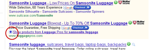
In November of 2007 Google had invited users to beta test a new form of advertising which was available to Adwords advertisers. At that time they called it the product plus box. The product plus box enabled advertisers to include additional information into each of their ads including pricing, product description, images, and more for up to 3 different products.

To view this information the searcher would simply click a plus sign next to the ad and instantly the ad would expand to show the extra content. Here is an example of what it looks like:

google_plusbox

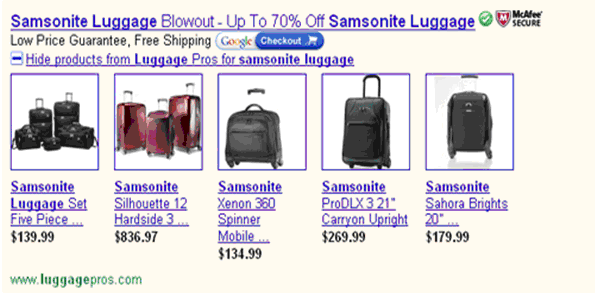
After clicking the plus the searcher gets the following:

google_plusbox_open

Here is an excerpt of what Google said about this technology.

“For ads associated with products in Google Base, a plusbox can be expanded to display relevant products from that advertiser. The plusbox provides users with more information about an advertiser’s offering even before clicking on the ad, and offers advertisers a new way to engage potential customers.”

Since its inception in 2007, the concept has grown and now includes two different ad formats; the good news is it doesn’t take a lot to get started. The thing I find hard to believe is that many stores are not taking advantage of this unique opportunity—likely because they never knew it existed or because they don’t know how to make it work. I can’t see any other reason why one would not take part.

Google says these new features help you to gain more clicks, gain higher quality clicks and gain higher ROI. Early tests show this seems to hold true.

While researching the addition of this feature to a few ppc campaigns I found that the information on what it is and how it works is scatter across the internet—because of that, it can be confusing to decipher proper implementation.

In this article I’ll sum it all up in one location and show you how to take advantage of the current ad format options provided to you through the various Google search channels; but before I do that, let me bring everything up-to-date.

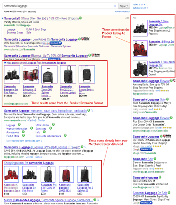
As of this writing, Google Base is now called Google Merchant Center. In addition, Google has developed its previous 2007 concept into what they call Product Ads. The Product ads have two ad formats: Product Extensions (formerly known as the Product Plus box) and a new feature called Product Listing Ads is also offered.

Google describes the difference between the Product Listing Ads and Product Extensions is as follows (from the Google website):

“Product listing ads are a stand-alone shopping ad format that uses product information from the advertiser’s Google Merchant Center account. These ads appear in a variety of formats and feature relevant product information, such as the image, price, or name. They can also include an optional promotional message managed in your AdWords account.

Product listing ads focus on targeting product information to users and are not designed to focus solely on merchants. For example, ads from competing advertisers may appear together in cases where multiple merchants are selling the same product.

Product extensions are an ad format in which product information accompanies a standard text ad with standard keyword targeting. They also use product details from a merchant’s Google Merchant Center account and feature multiple products from only that merchant. Product information appears next to the text ad, which allows users to get a better sense of the advertiser’s product selection prior to clicking through to go to the advertiser’s site.

Together, the extension and listing ad formats provide a single product ads offering in AdWords, both using product information from the same Google Merchant Center account that’s linked to your campaign.”

Product Extensions

In short, Google Product Extensions (the plus box) works just like it did in it early days. Searchers have the ability to see products images and title text under your AdWords ad (your sponsored listing). They achieve this by clicking on a + sign found next to the ad. You are not charged for this initial click (for them clicking the + sign.) If after clicking that plus sign the searcher decides to click on any of the information they find within the expanded results, you are then charged for the click as part of the typical Adwords CPC model.

Google offers this additional information on Product Extensions (from the Google website).

“Product extensions allow you to use your existing Google Merchant Center account to highlight your products directly in your Google.com search ads (and Google Images ads when opted into the Search Network). Product extensions will not appear on other Search Network sites, or on Display Network sites.

When your AdWords ad appears and your Google Merchant Center account contains a product that is relevant to the searcher’s query, product extensions may show the images, titles, and prices of your closest matching products with your ad. Your product offerings may be shown in a “plusbox” ad. When a user clicks a product image, they will be taken to the destination page listed for that product in your Merchant Center account.”

Product Listing Ads

Product Listing Ads are designed to take advantage of either a CPC (meaning you pay when a visitor clicks your ad) or CPA model (meaning you pay only when the click results in an actual sale on your site) however, at the moment, only a select few larger advertisers are offered the opportunity to give the CPA model a try.

Product listing ads currently appear in the right hand search column and do not include the opportunity for expanded information via a + sign. What you see is what you get yet the setup can be controlled to some degree by what you feed Google.

Google offers this additional information on Product Listing Ads (from the Google website).

“Product Listing Ads are search ads that include richer product information – including product image, price, and merchant name – without requiring keywords or ad text. Whenever a user enters a search query relevant to an item in your Google Merchant Center account, Google may automatically show the most relevant products along with the associated image, price and product name.”

Putting the Pieces in Place

Now, In order to make this all work you’ll need several things in place.

  1. A Google Merchant Center account.
  2. An Adwords account.
  3. Your Adwords account linked to your Merchant Center account.
  4. Your Merchant Account linked to your Adwords account.
  5. A product data feed (fed into your Merchant Center account.)

I won’t go into how to setup a Merchant Account in this article or the associated data feed, but I will give a brief overview of how to tie your Adwords and Merchant Center accounts together.

Keep in mind that you can add multiple AdWords accounts to a single Google Merchant Center account by following this same process for each account you would like to link. When you do this, be sure to link accounts in both the Merchant Center and AdWords interfaces to complete the process—linking on one side only will not work.

Linking Accounts in Google Merchant Center

  1. In your Merchant Center account, click Settings, then AdWords
  2. Enter your AdWords Customer ID and click Add

Linking Accounts in Google AdWords

After linking your Merchant Center account to your AdWords account, your work is not complete. You must now link your Adwords account (from the Adwords side) to your Merchant Center account. The following instructions will show you how to do that.
Create a new campaign with product extensions with these steps:

  1. Under Ad extensions > Products, check the box next to “Extend my ads with relevant product details from Google Merchant Center.”
  2. Select the Google Merchant Center account you’d like to associate with your campaign. (Your Merchant Center account must be linked to your Analytics account for this to appear).

It can take up to 12 hours from the time you update your settings for your product extensions to appear in your ads.

If you’re creating a new Merchant Center account, be aware that you may only register one domain with the account. If you would like additional domains registered with Merchant Center, you must create a new Merchant Center account for each separate domain.

Three for One Exposure

I’ve talked about the two ad formats offered by Google here but did you know that implementation of the outlined information within this article gives you the opportunity to gain potential exposure for your products in three different locations found within Google search? The key is the Merchant Center account. With that (and the proper linking demonstrated above) you get three chances for exposure.

The triple pronged exposure comes from the Product Listing Ads, the Product Extensions, and the direct feed from the Merchant Center account (i.e. Google Product Search results integrated into natural search listings.)

The image below shows exactly where each of the three spots might be and which Google ‘product’ feeds them.

google_search_listings

The opportunity present by taking advantage of this Google offering is just too good to pass up. If you haven’t taken the time to fully integrate your products into Google search, now is the time to do it. The opportunity is completely free and the results from those using it currently are good—but you can’t capitalize on it if you don’t try it.

Filed Under: Search Marketing Tagged With: google merchant center, google product ads, google product extensions, product listing ads

« Previous Page
Next Page »

Primary Sidebar

Sponsors

MemberPress Wordpress Membership Site Plugin

Categories

  • Articles
  • Blogging
  • Breaking News
  • Conversion
  • Customer Retention
  • Design & Usability
  • E-Commerce Optimization
  • Email Marketing
  • Featured
  • Marketing Strategies
  • Mobile Commerce
  • Search Marketing
  • Shopping Cart Abandonment
  • Social Media
  • Uncategorized
  • Website Analytics
  • Zen Cart Contributions
  • Zen Cart Optimization
  • Zen Cart Recurring Billing

Copyright © 2023