In one of my previous posts titled Most Important Pages on an Ecommerce Site I mentioned the most important pages on an ecommerce site.
In a later post titled Most Important Parts of a Product Page I broke down the various sections specific to a product page. In this post I wanted to point out a number of elements that should be present on the home page of any ecommerce site.
Although a well optimized — from an seo perspective — ecommerce site will likely receive traffic entering on any number of sub pages (rather than the home page), the home page will see its fair share of traffic.
Keep in mind I am not saying the home page will receive less traffic than other pages on the site. I’m saying that any number of pages on a site can be the entry page. This is how each website should be built anyhow — each page being considered a separate landing page which can receive traffic at any given moment from any source.
The home page though does play an important role in the overall picture of a successful ecommerce site. It is the page that many visitors will turn to even if entering first on another page within the site and is the page that no matter what, can set the tone for the rest of the visitor experience.
Although not the only elements, I’ll present below 4 important elements a good home page should possess for driving ecommerce sales.
1) Displays a clear offer. It can have multiple offers but works best when the “featured promotion” (that which you are looking to push hardest) is given prominence. If this is a monthly sale you run, give that sale front and center attention then support it with additional creative.
The image below shows an offer that could be considered the feature.
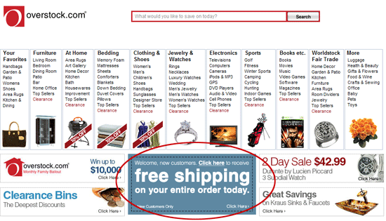
It clearly attracts your eye even when additional offers are presented and drives home the message that if you buy from Overstock.com you get free shipping on your entire order.
The offer, although simple, does even better to win the sale though. It creates urgency through adding just one simple word — today. The use of that one word alone strengthens the offer for building sales on the company side and persuades the visitor to act now or else potentially lose the opportunity to receive free shipping.
I talked about creating urgency in my post titled Planning Ecommerce Promotions.
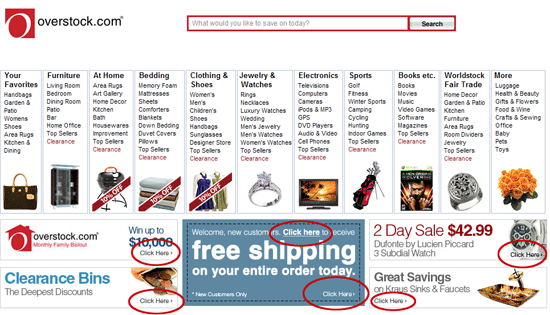
2) Contain a clear call to action. A call to action persuades the visitor to act upon something. This can be clicking a banner to see the monthly sale item(s), signing up for a newsletter mailing, adding an item to their cart, etc… Each of these actions should contain a call to action that supports the end result.
Common calls to action on a home page might be in support of sales, new products, daily features, and more. An example call to action would be a banner with details on the sale of the month and the text “click here to shop now!’
The image below is a good representation of the use of calls to action.
3) A clear and precise navigational path for accessing site content. This may seem logical, but many sites neglect the “clear and precise” portion. They provide navigation not thinking of how it is presented nor how it will impact their visitors.
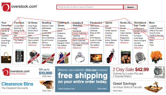
4) Multiple presentations of accessing the same information within the site. Most home pages receive a variety of visitor demographics. Each visitor is seeking products to fit their needs yet each searches in a different manner to get to those results. One visitor may use the main navigational elements within the frame work of the site while another may prefer to read a little more before committing themselves.
You must learn your demographics and address them accordingly. To illustrate this point let me present this conceptual example. Let’s say you sell beach clothing.
Two different visitors arrive at your site — both looking for the same product.
The first visitor is going on vacation in the coming weeks and is looking for an outfit to wear on the beach. The second visitor lives on a beach and is looking for the same outfit.
Navigation that might speak better to the first visitor would be a heading that says “Outfits for Vacation” (with a subset of links pointing toward things like beach outfits, bathing suits, sundresses, etc…) while the second visitor may respond better to categorical navigation that simply says “Bathing Suits.”
A good example of how to deliver links to similar content from different angles can be seen in the home page screenshot below. Take note of the lines connecting links to similar products. Notice how they appear in not only different context at times, but also under different headings — each targeting a different search habit based on visitor demographic.
In order to get your home page working to drive visitors deeper into your site you must speak to the various demographics in a language they understand. To do this you obviously must know what your visitor demographic is compromised of. If you’ve planned out your business correctly then you should have a good idea of the answer to that question.
If you don’t know the answer you better go back and find it out. You can’t expect to grow business by randomly targeting any person that comes to your site. The list of items I presented in this article should give you a start for shaping your home page to work for your audience.