Moving customers through the checkout process effectively is a critical element toward closing any sale.
Throughout this process you will need to continually provide them with the necessary elements which ensure they feel comfortable enough to complete the action (i.e. buy your product.)
Checkout abandonment is a problem that all ecommerce sites see in some degree. The rate at which your visitors abandon depends on how effective you have structured the process. Once you get them started on it they may leave, but you don’t have to make it easy on them to do so. Some site owners are doing just that.
The Problem Revealed
There is an inherent problem I have seen on a number of ecommerce sites who’s owners attempt to provide their customers with the “right information” at the “right time” with the hopes of persuading them to complete the checkout. These sites oftentimes do a good job of placing the elements but fail in one other important area — how they present the information the element leads to.
The way this information is presented can either help or negate to some degree the intended effect. In the examples I have seen, the sites present the user with a hyperlink element linking them to a point of customer assurance which resides on a new page within the site. This can be a link to the shipping rate schedule, a guarantee, contact information, or more.
However, the way these sites have implemented the elements actually ends up taking the visitor further away from the checkout process — not what you want if you are trying to close a sale and win over a customer.
Implementation
For the past several months I’ve been testing the two methods against each other. One method uses hyperlink elements that “feed” customer assurance information to the visitor via a link to a new page, and the other feeds customer assurance information via a non-blockable DHTML hover box. The results were not surprising.
The method which utilized the DHTML hover over boxes had a positive increase on the website conversion in the areas it was utilized. In contrast, in instances where the information was fed to the user via links to other pages on the site (taking them away from the checkout process), the abandonment rates were higher and the conversion lower.
When asked, users attributed their abandonment to confusion relating to “how to get back into the checkout process” at the exact point they were at when they left it to view the “assurance” information.
Below are two screenshots. Figure 1 shows the typical way I saw this method utilized on sites; with hyperlinks that took the user out to other pages in order to get the information they sought. Figure 2 shows the after effect using the more effective DHTML hover over box which gives the end user what they seek without taking them away from the checkout process.
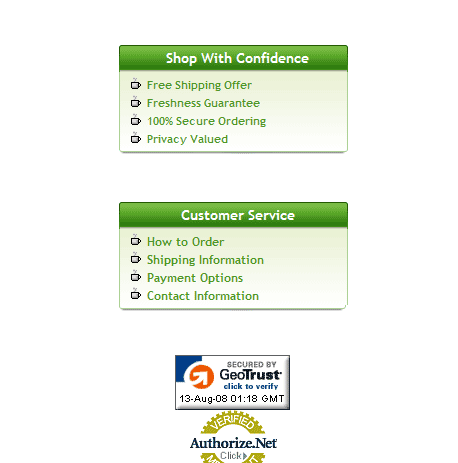
Figure 1
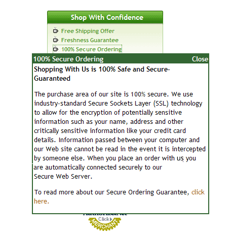
Figure 2
Others have tried to circumvent the misfortune of leading users away from the checkout process by providing the information in a traditional “pop-up” window. Not a bad idea, but still not the best. Why? Because with the many pop-up blockers built into browsers now, these clicks may only frustrate them again.
The answer is to provide the information to them in a non-blockable DHTML hover over type window. You can even set these up to activate “on mouse over” if you wish which will present the information simply by hovering a mouse over the link.
You’ve now got yet one more tool to use in your quest for increased conversion. Use it wisely and you will be rewarded.
To your continued success.
This is another great tip – how not to take you’re paying customers away from the till and then not show them back to it.
It’s a bit like leading the customer away from the checkout paying queue, to the Manager’s office to explain a few things and then abandoning them outside the office and not leading them back to the queue, in the position where they were!
If all of these advised tips are utilised, there will be a lot less confused and irate shoppers and more happy store owners, with higher conversion stats.
Thanks for all you’re advice,
John
An example of how to create this type of a hover box or a link pointing to a resource would be helpful.
The effect was achieved using DHTML. I have a bit of code that will be being uploaded to the Zen Cart downloads section for those of you on that platform. Should be up soon.
Excellent, thanks!!
Very interesting article thanks. Are there any general industry statistics available on the average % of people who abandon checkouts ie. exited from the checkout page without completing?
We currently have a rate of 12-15% and have no way of gauging if this is good or bad.
Thanks for the help.
If 12 – 15% is your average across the entire checkout process, then you are doing well. The industry average is 54% abandonment at the time of this writing.
Eric-
Have there been any codes added to the zencart download yet on how to code your “customer assurance” link into dhtml hover, as I have already setup my boxes on my product pages an sign up page, but would love to have that hover function as well working for the customers.
I’d love example code, too. I spent a while googling trying to find examples but I’m coming up empty…
Try “Dynamic Drive”. It should have some good sample code to start with.
Not yet. However, I do have the code ready so I’ll make it a point to upload the first version here and get it out. I was hoping to make additional adjustments but will put the first release out as is.
Keep an eye out for that.
Is this ever going to be released? I tried experimenting with it, but it doesn’t work as good as you show.
Sean,
Yes, it is actually one of the free modules I provide to those in my membership site. That is due to be launched in the next 2 – 3 weeks or so.
You can get on the notification list by going here:
http://www.ecommerceamplifier.com