With the tools available today, just about anyone can design a graphical banner for a promotion. But designing a banner and designing a banner that gets results is quite different.
In general you want to design your promotion to work with the user eyeflow. Standard reading is left to right so this works best. Placement of elements within the ad also is important and should be considered.
Here are some things your promotional banner could (or should) include in order to increase it’s effectiveness.
1) If using photos the photo should reflect the promo to some degree and should have room to integrate headlines etc… without making it difficult to read. Oftentimes finding the right photo can be the toughest part. The photo should direct the eye to elements within the ad yet not overwhelm. Sites like iStock have a great selection at very reasonable prices.
Example of Good Photo Usage
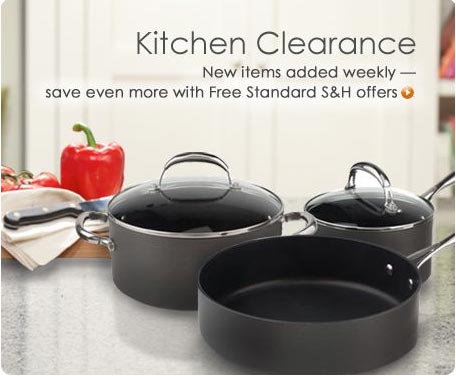
Example of Poor Photo Usage

2) A clear call to action. Examples would be “Shop Now”, “Start Shopping”, etc… Due to eyeflow, and depending on your layout, the best location for this is typically the right hand side of the banner (even bottom right corner is good), but that is not critical if you make it stand out and fit it within whatever eyeflow you choose for the promo.
Take note of how your eye flows and is drawn to the call to action in the following ad.
Example of Good Call to Action

Example of Poor Call to Action

3) A primary heading or focus area that grabs attention and conveys what type of promotion or message you want to deliver. Things like “24 Hour Sale”, “Grand Opening Sale”, “50% Off Sale”, “Storewide Clearance”, “Free Shipping Now Thru ‘xxx'”, “Holiday Blowout”, “Everything Must Go”, etc…
Oftentimes, but not in all cases the photo can play a role in delivering a primary focus area as seen in the examples below. The more active the photo (and with no clear “text area”) the harder it is to create focus and flow. A good ad gives the eye a starting point and then directs it in a specific pattern toward the call to action.
Example of Good Primary Focus Area

Example of Poor Primary Focus Area

4) Benefits to the customer. (i.e. what do they get from the offer and/or product). This is often best completed in short text or bullet point descriptions. Give them a reason to click.
Example of Good Benefits
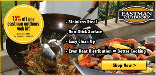
Example of Poor Benefits

5) Avoidance of centered text. Centered text is hard to read. You want all text to be preferably left aligned and in some cases right alignment might work. The only time you should use centered text is in headers — and that too depends on the layout of the photo and message. When in doubt, left align text.
Example of Good Alignment

Example of Poor Alignment
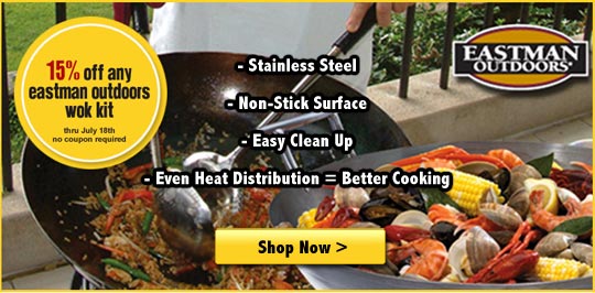
The above is just a very brief sampling of ad concepts. Again, placement of these items is important and should be considered during development. Promotions can vary widely and should be based upon your individual goals and objectives. Testing is key and what works for one company many not always work for another.
Got any additional insights to share? Let me hear them below.
[…] Comments […]